FOLGERS GOLDEN GIVEAWAY (exploration)
Photoshop
The Ask:
As a freelance designer on a full-time contract with an agency, a lot of the times, I’m put on a project where they need an extra set of hands and/or a fresh designer’s prospective on the brand or the brand’s ask. This was one of those times.
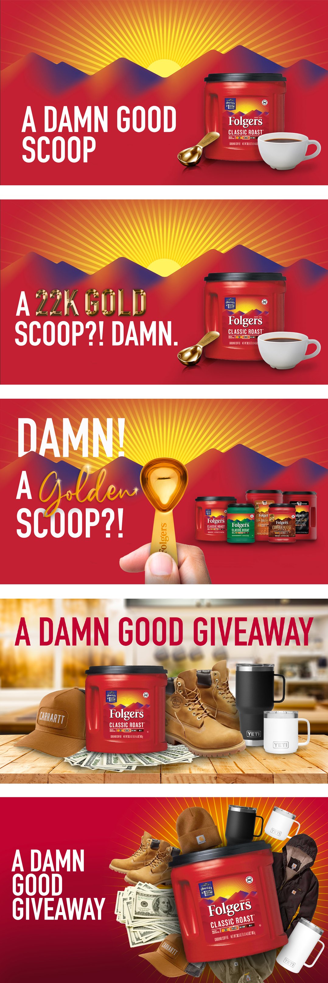
We needed a couple more Key Visuals for a Folgers Giveaway campaign. Starting at the bottom of the page: The first “way in” was the chance to win a variety of available prizes — cash, Yeti merchandise, and Carhartt merchandise. With the first KV, I used the Folgers rays to make a blasting of the prizes behind the [purchase of] Folgers coffee. With the second KV, I did more of a kitchen-in-the-morning/morning-coffee route with the prizes and coffee on the counter.
The second “way in” was the chance to win a 22K gold coffee scoop. With these 3 KVs, I mostly just played around with layout. The first one uses the gold scoop as a replacement for the Folgers sun behind the mountains + emphasizing the “gold” in the typography…with the Folgers lineup to the side. The last 2 KVs replace the Folgers lineup with a single canister, a mug of coffee, and the golden scoop. One highlights the 22K in the typography while the other’s more simplistic.
After 2 rounds of Key Visuals, this was the last I saw of the project, so I’m not sure which route the client chose. I really enjoyed the process and exploration of highlighting the prizes and the golden scoop.
Deliverables:
2 Key Visual routes

